strategy.
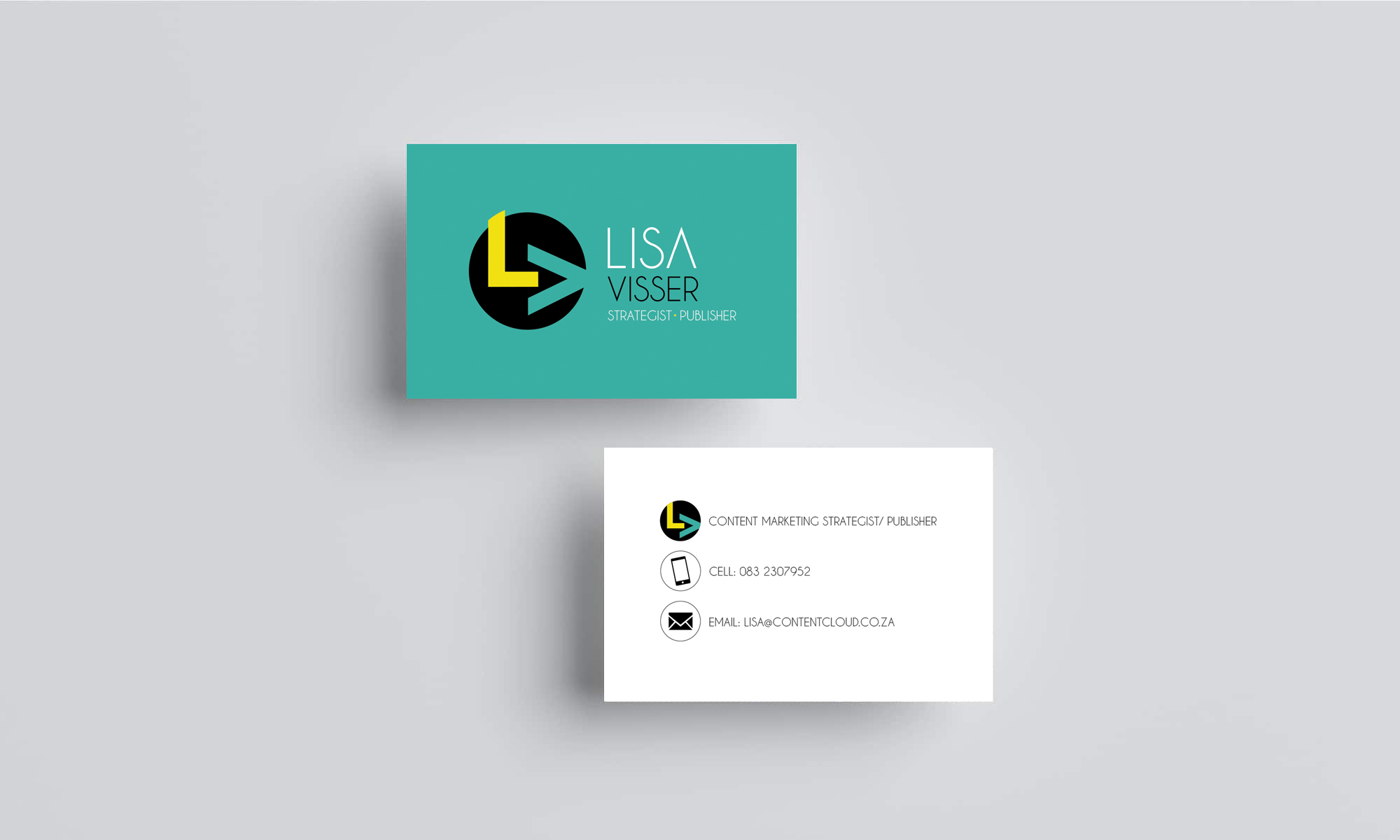
The look and feel needed to bold and professional.
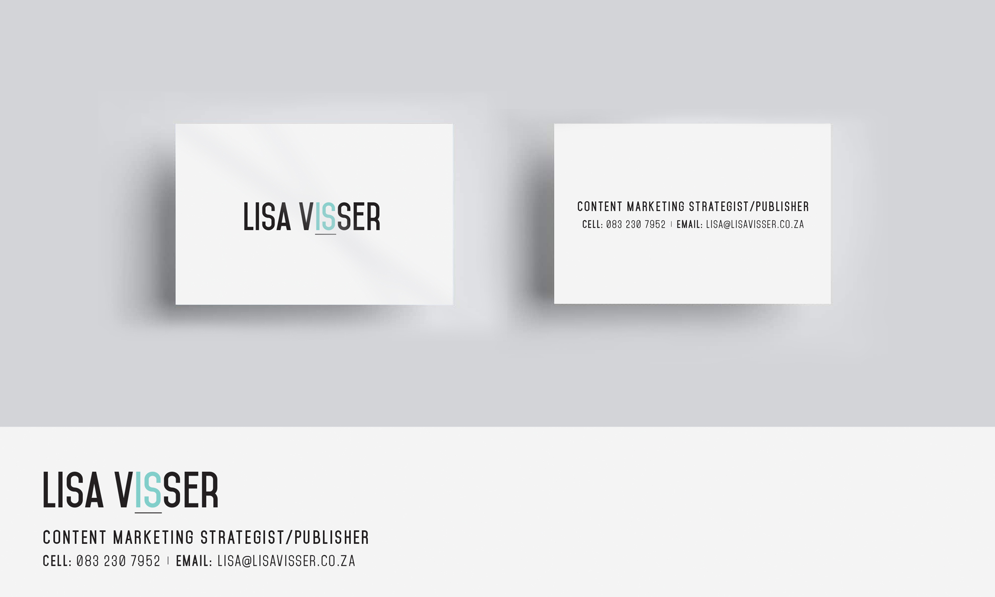
I presented a few examples where there were subtle colour or illustrative lines in the brand name to create more depth in the designs.
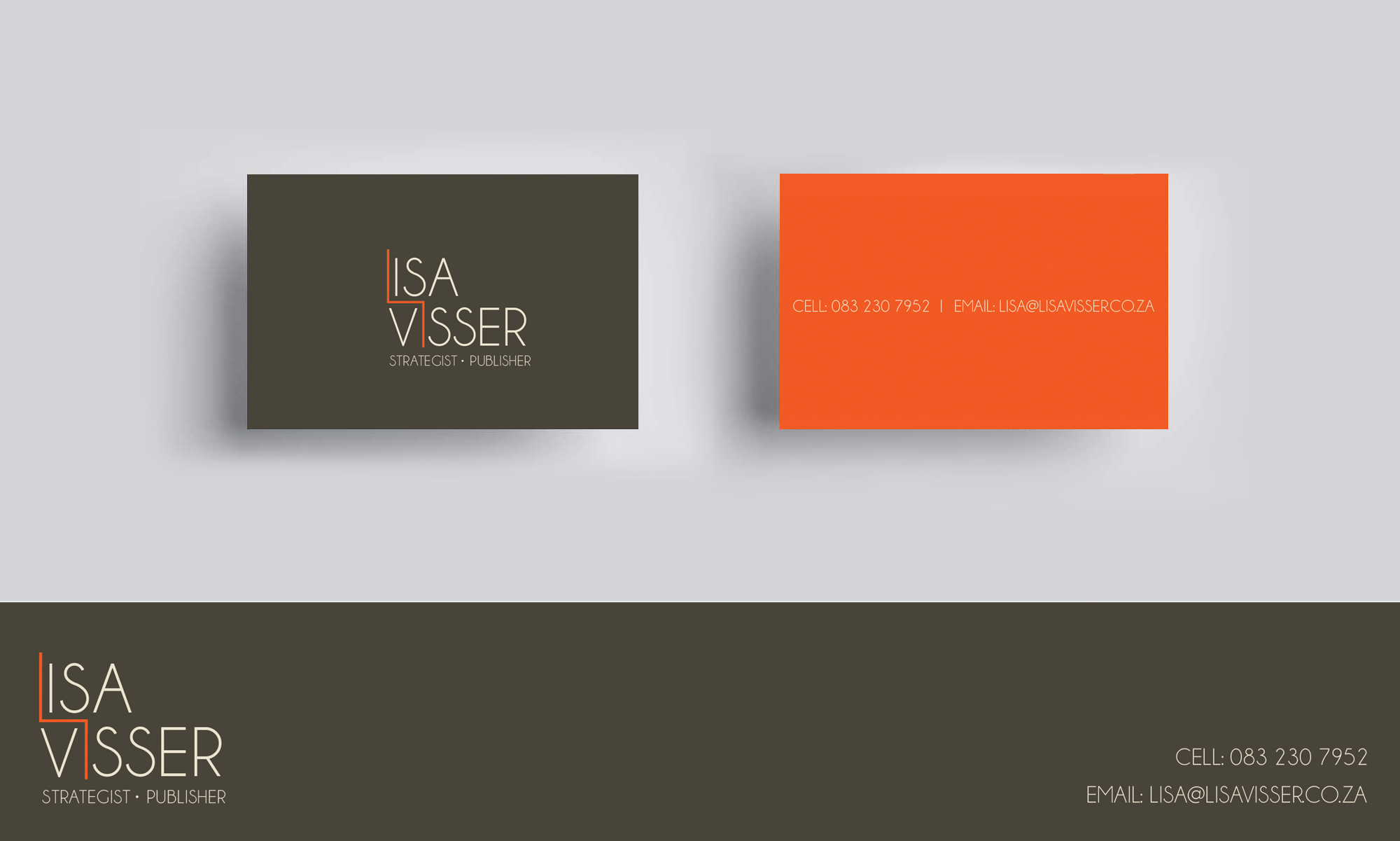
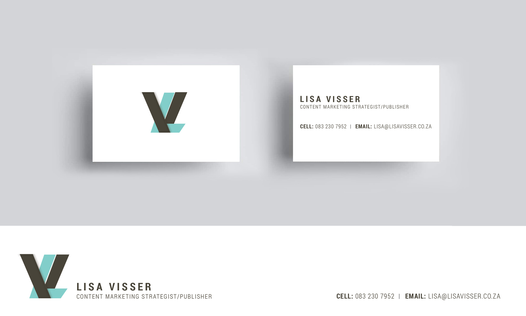
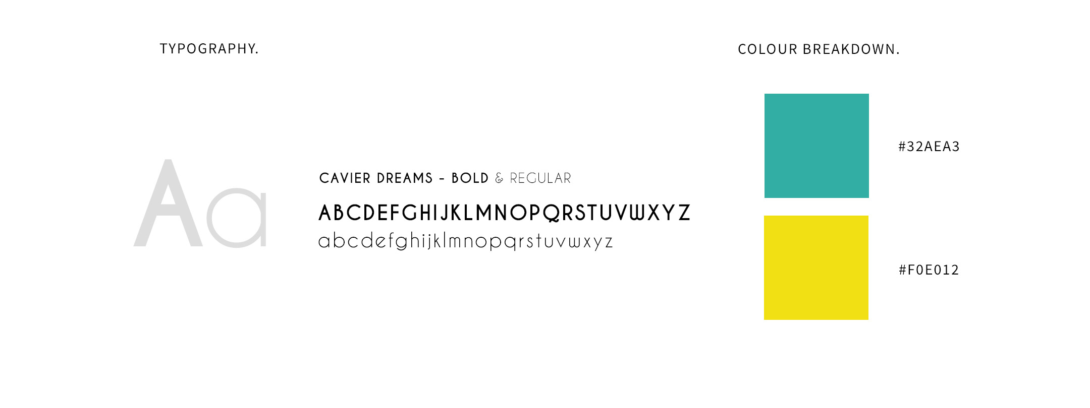
After consideration, I decided a bold and less conservative approach would better suited to grab the attention of potential clients. A bright yellow and teal colours palette were chosen.

outcome.
A hip, modern brand identity that illustrates the client knows the way.
what they said.
I tasked Colleen with creating a brand identity for my new business in 2015. I required a corporate logo as well as business card and document templates and an email signature. Colleen is very creative and thorough in her work. She works tirelessly to design work that suits your brand and to fit your brief. Her work shows her years of experience and her approach her willingness to go the extra mile to ensure her clients are happy.
Lisa Visser
Content Marketing Strategist
Leave a Reply