Every year a national Expo campaign is pitched.
A concept is chosen and rough mockups are created. Before the campaign can be translated to digital, a pdf presentation showcasing the pre-launch of thenext year’s campaign is designed. The campaign is then translated to digital where social media and the expo websites showcase the new expo theme.
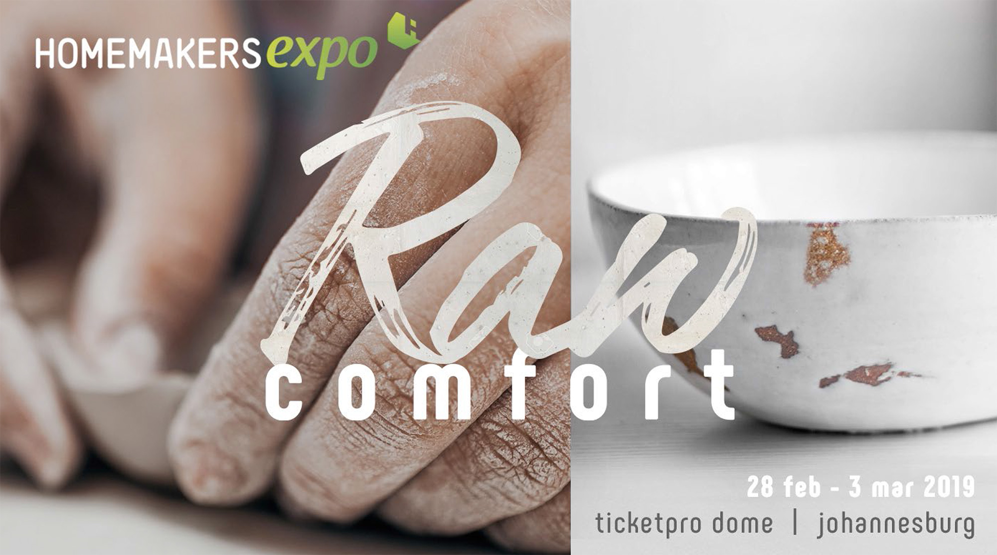
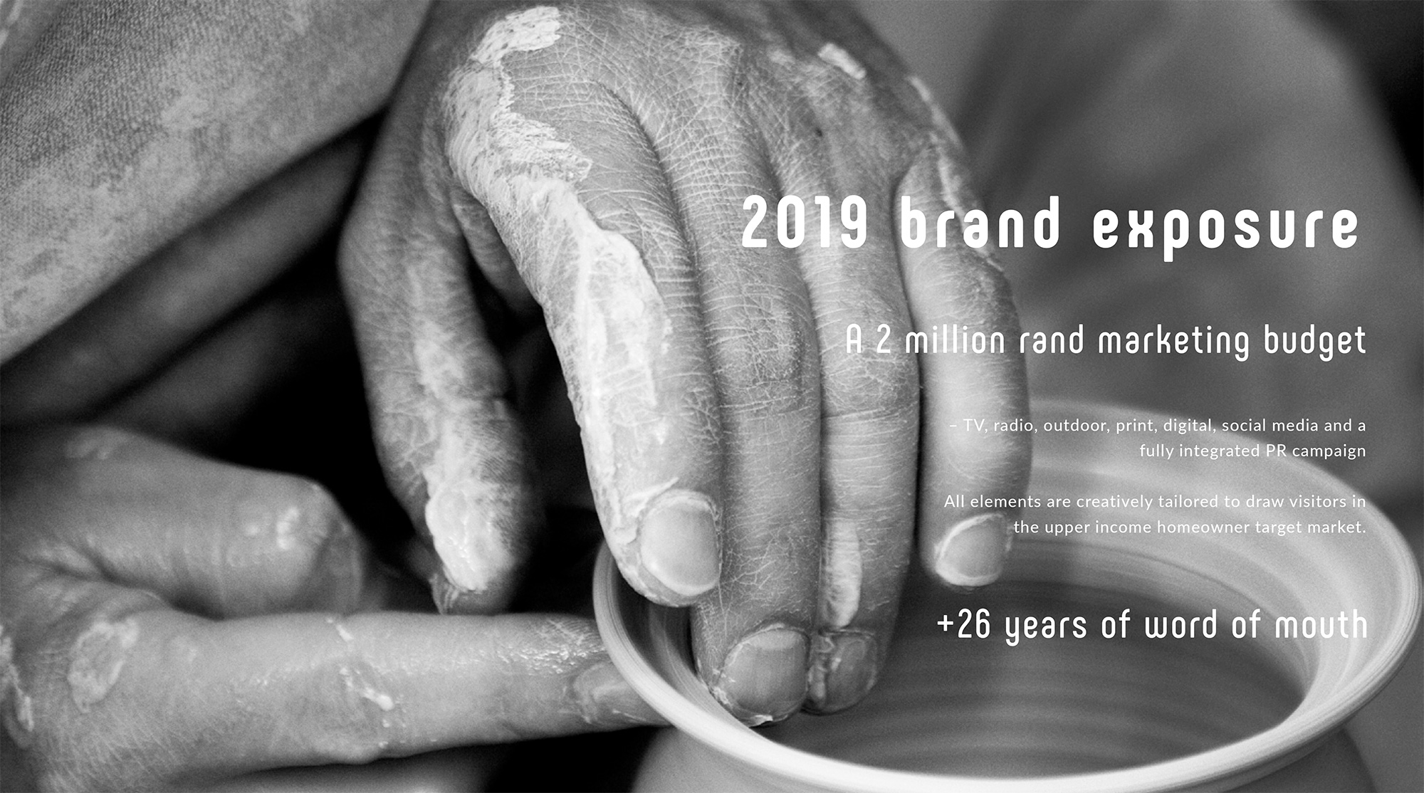
2019 campaign.
– ‘Raw Comfort’
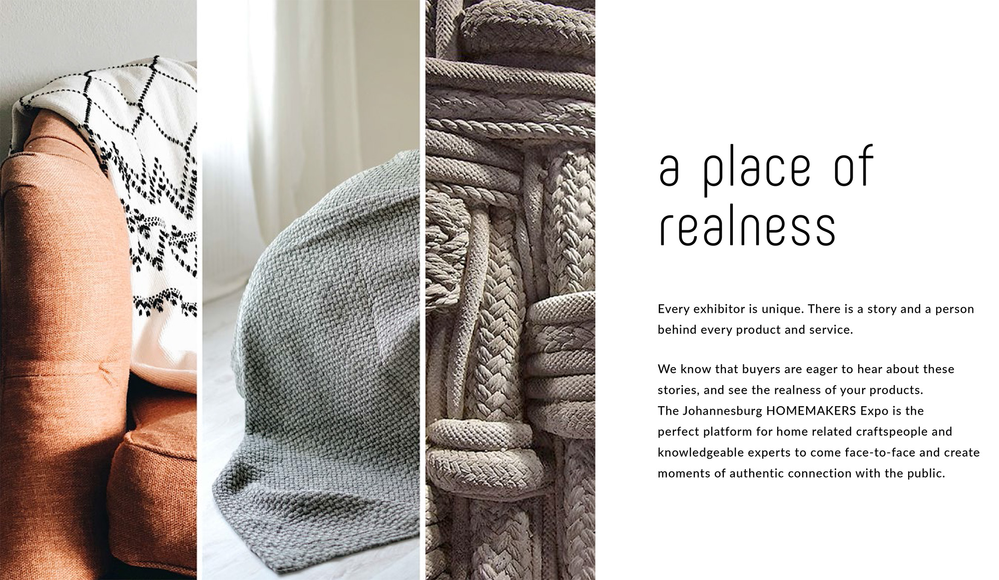
The initial concept was on the japanese movement, Wabi Sabi. The definition meaning the beauty in perfect imperfections. We concentrated on the connection between the exhibitor and their products. A place of realness and authenticity. A step closer to nature. What the products are made up of and the journey the exhibitor takes from inception of an idea to the raw materials, and finally the production.
To appeal to the emotional side of our consumers, we have used close up of hands, using their skill to build their product. People are interested in finding out what things are made up of. By using this transparency, it gave this campaign an element of raw honesty, connecting with the consumer.
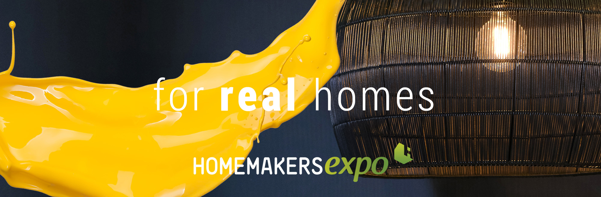
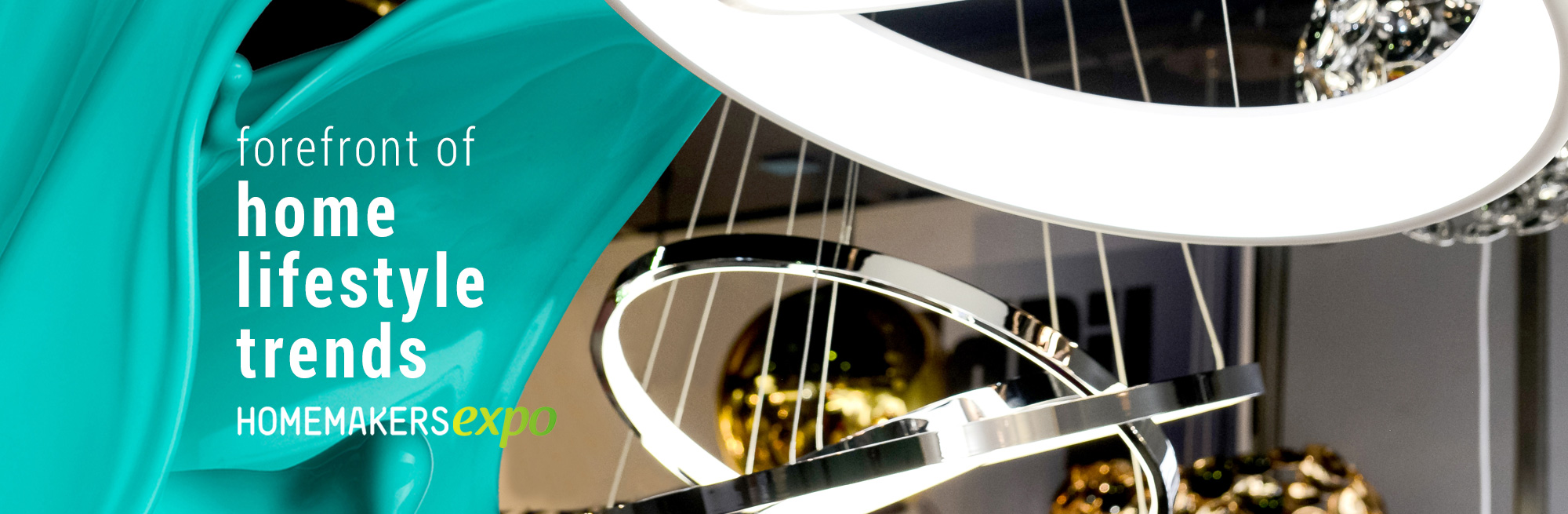
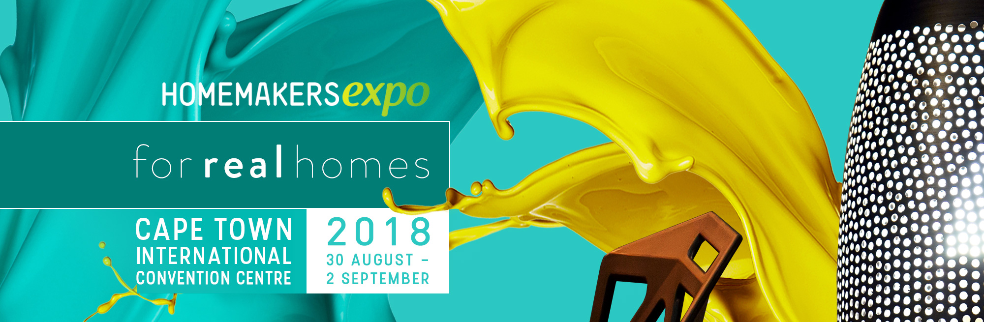
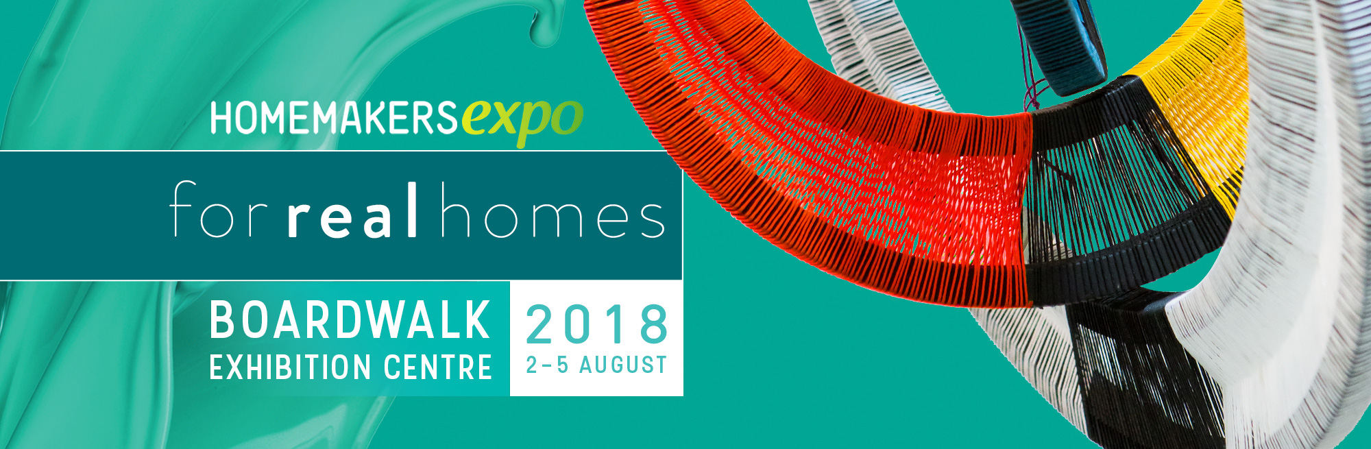
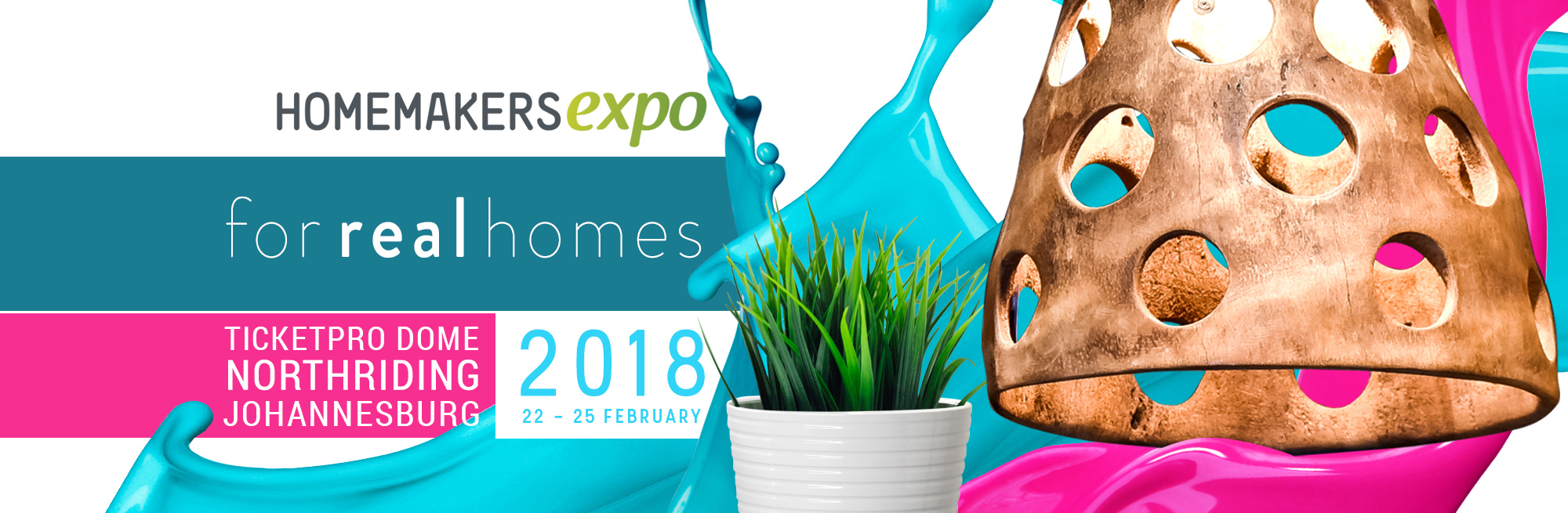
2018 campaign.
– ‘for real homes’
The campaign imagery focused on zoomed in, close-ups of products paired with a paint illustrations. We used bright, highly saturated two-tone colour palettes for each region.
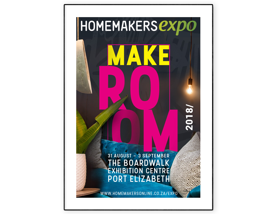
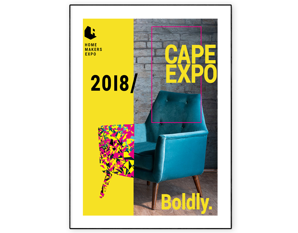
additional pitch concepts.
These were two other ideas I created for the national campaign.
what they said.
'I am blown away.....I am so excited - and very proud to launch with this campaign! Its bold, its beautiful, its completely out the box (which I love), its on trend and very inspirational.'
'Oh I am blown away! This is a great brochure and landing page. I love what you have done with this campaign, it is relevant without falling into the trendy trap, it speaks to what I believe the consumers now wants. It is coherent from design and copy to photo collection.'
Leave a Reply